Main challenge: creating a clear, easy-to-navigate UI that
could still support a wide range of features.
After much iteration and discussion, we finally landed
on a solution that felt both intuitive and functional.
Malmö Initiative
2023
My role
Designer
Platform
Desktop & Mobile
Tools
Problem / Task
Our team was tasked with redesigning the Malmö citizen proposal platform to better meet the needs of it’s users. The existing interface was outdated, visually unappealing, and difficult to navigate. Users expressed frustration over unclear information, a lack of feedback from the municipality, and limited interactivity.
01. Research
In the initial stages, the team set out to gather inspiration to create a clear vision of how we wanted our version the platform to look, both visually and functionally. Since our target audience was broad—covering all ages and backgrounds—this was a challenge. By analyzing the diversity and reviewing existing solutions, we were able to refine and sharpen our focus.
We wanted to create a design that reflects Malmö’s identity—culture, diversity, sustainability, and inclusiveness—while maintaining a modern and accessible feel.
To simplify this, we explored UI templates and visual concepts on Pinterest and Google, which helped us find the right style and structure for the platform.
1.2 Feedback from users
Myself and a team member conducted semi-structured interviews with teachers and students at Malmö University to understand what a typical user expects from the Malmö Initiative. We focused on the current design, functionality, and suggestions for improvement. This is what we learned:
1
The design was dull. Users wanted a livelier look, bigger buttons, and better usability.
2
Users felt overwhelmed when creating initiatives and suggested clearer, more structured content.
3
They wanted feedback, status updates, and notifications to follow their own and others’ initiatives.
4
Most preferred a mobile app but also requested a desktop version for easier access across devices.
02. Ideate
These wireframes served as the foundation for our redesign.
03. UI
Logotypes
The City of Malmö has an established visual identity guideline to ensure consistent branding across all channels and contexts. We followed this guideline and used the official colours, fonts, and logos to make sure the platform has a recognizable look and feel for users.
Typography
The official typography of the City of Malmö is based on two font families: Myriad Pro and Adobe Garamond.
Myriad Pro Bold
Myriad Pro Regular
Myriad Pro Light
Adobe Garamond Pro Bold
Adobe Garamond Pro Regular
-
The primary font is Myriad Pro, used for headlines, subheadings, and most text elements.
-
For longer body text, Adobe Garamond is used when Myriad Pro may compromise readability.
-
All running text is set in Myriad Pro Light or Regular, with no additional letter spacing.
Colour Scheme
The design guidelines include two colour palettes with different purposes. While we initially planned to use the primary palette for its focus on brand-building, we ultimately chose the secondary palette instead. It offered more flexibility and energy, which allowed us to create a dynamic design that still reflects Malmö’s visual identity.
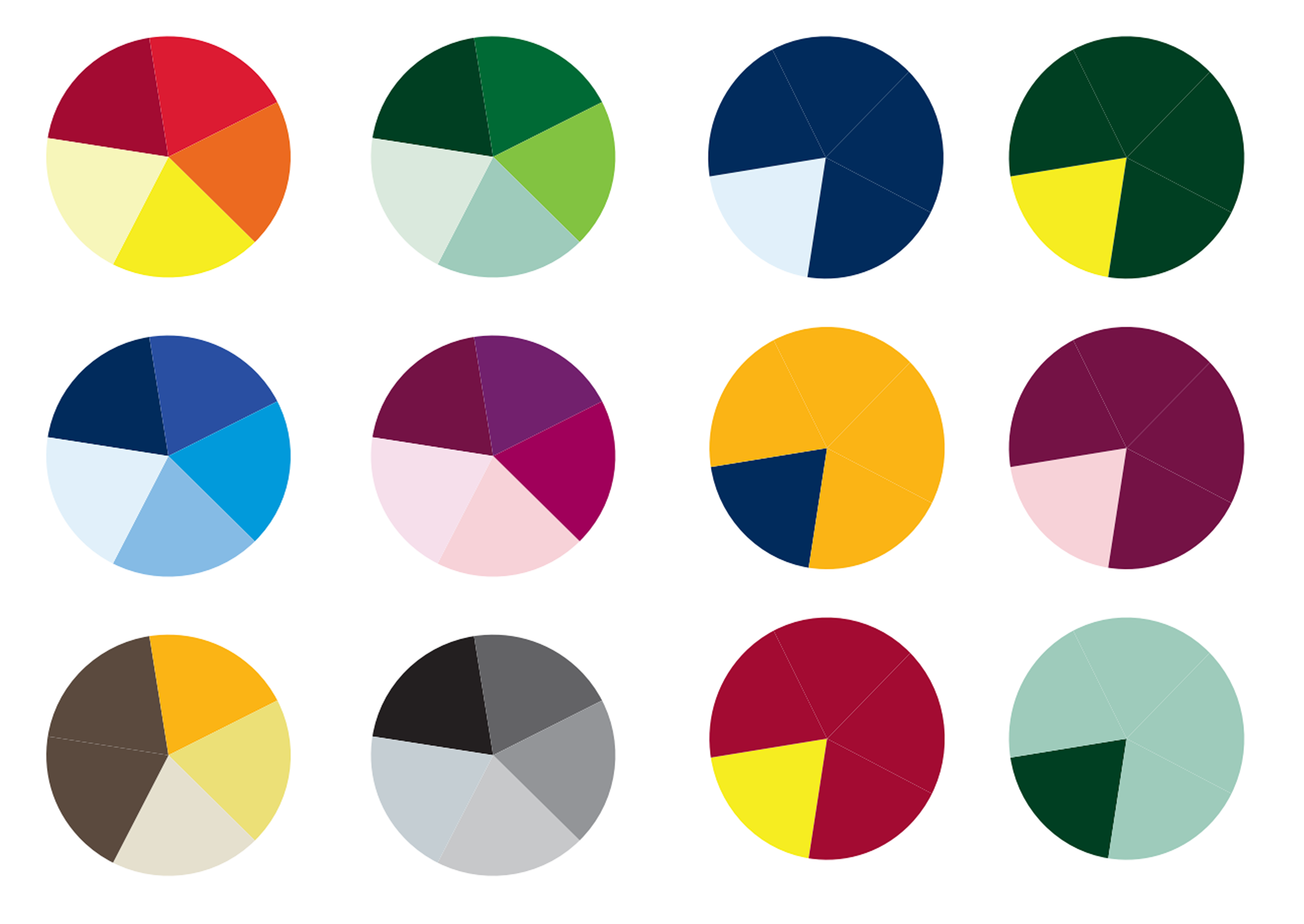
Guideline palette
#046A38
#72246C
#D86018
#D1E0D7
#EEDAEA
#F0B743
#000000
#646464
#CFCFCF
Selected colours
04. Validation
The prototype went through several visual stages. Each team member created their own mockup using the wireframes as a starting point. We explored a few different versions, but the interface didn’t fully match the experience we were aiming for.
05. Lessons learned

Iteration is essential
I learned that the first idea is rarely the best one. It took several rounds of redesigns and feedback before the UI felt intuitive and aligned with our goals.
Visual identity matters
Following Malmö’s graphic guidelines taught me how branding choices (fonts, colors, structure) impact how trustworthy and cohesive a product feels.
Collaboration creates better results!
By working individually and then comparing solutions, we pushed each other to think broader and refine the design collectively.
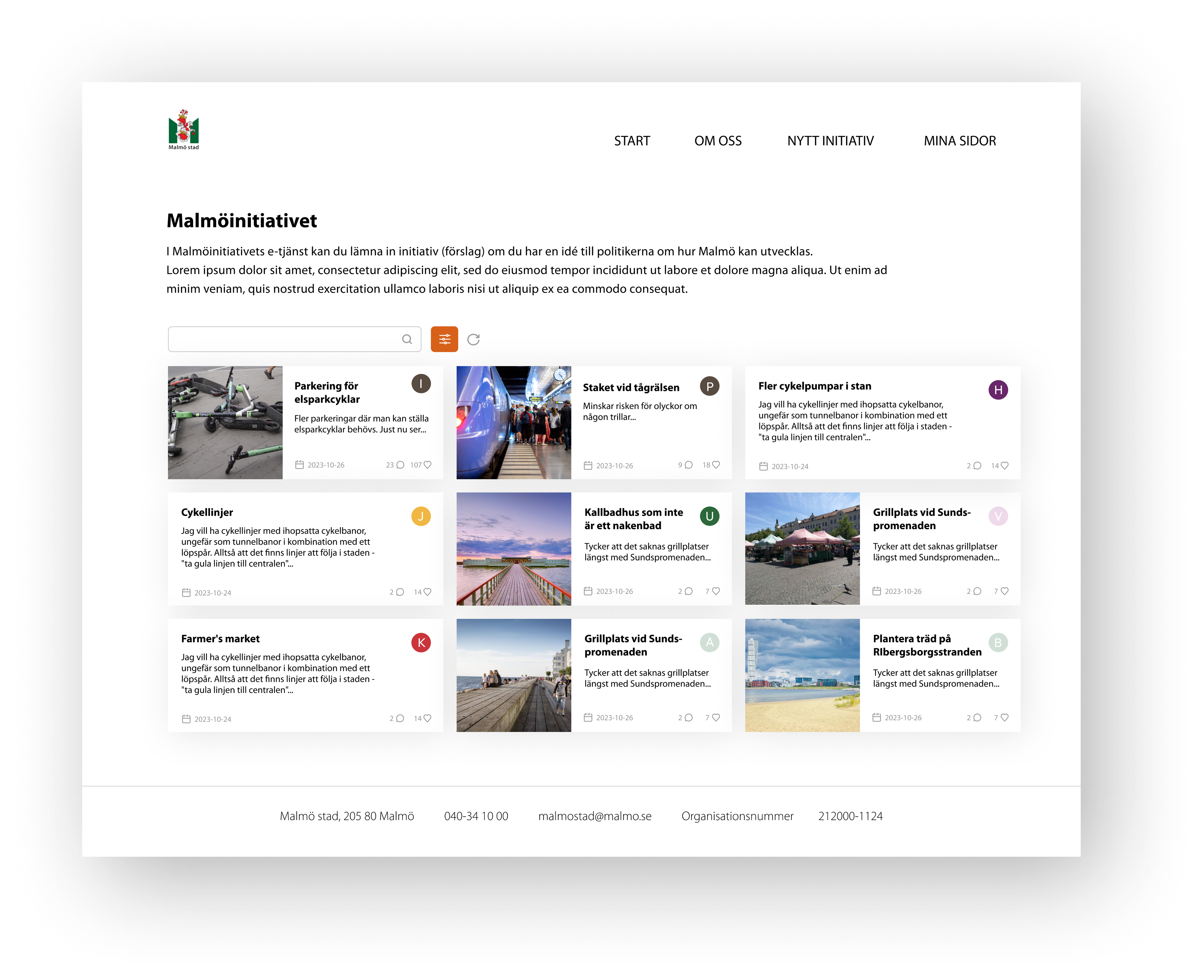
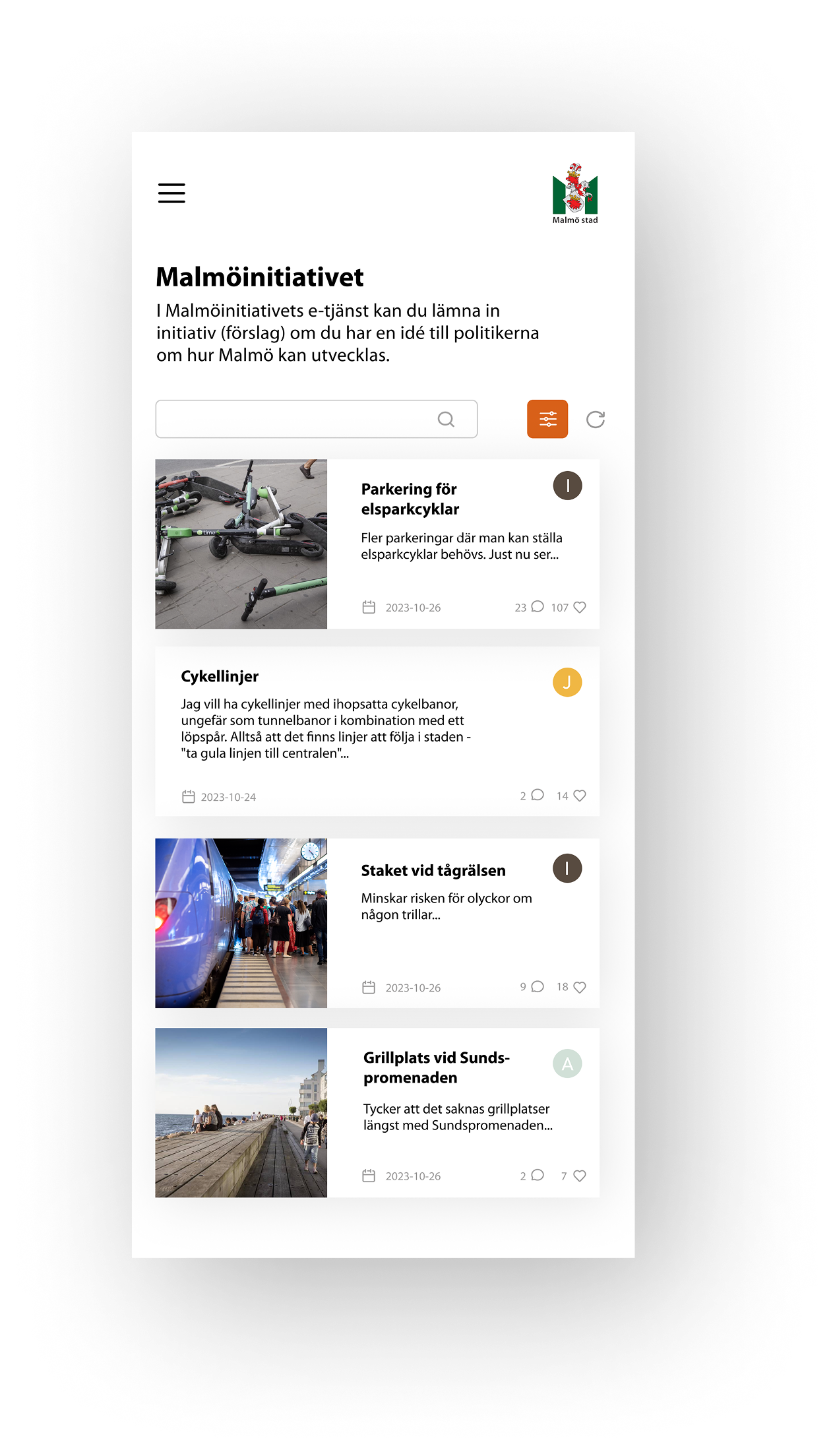
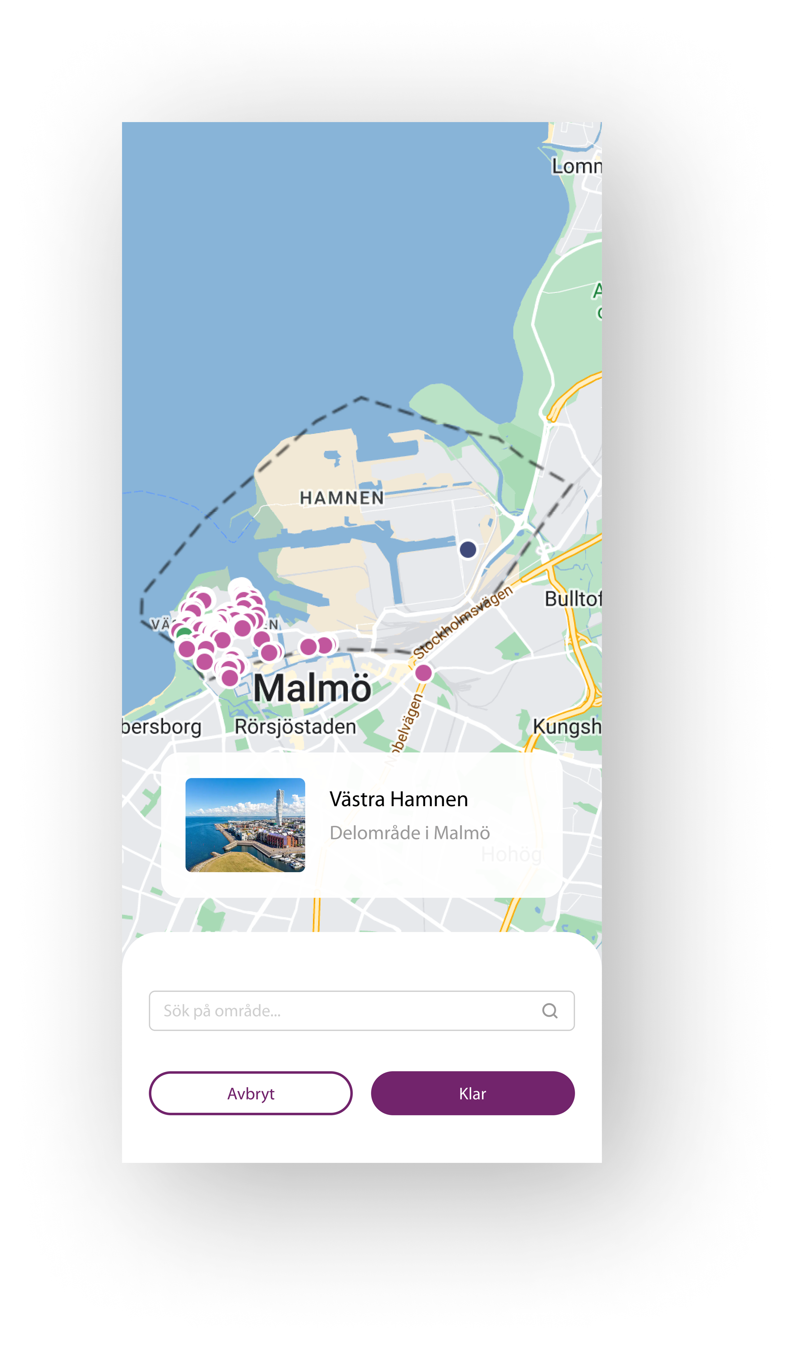
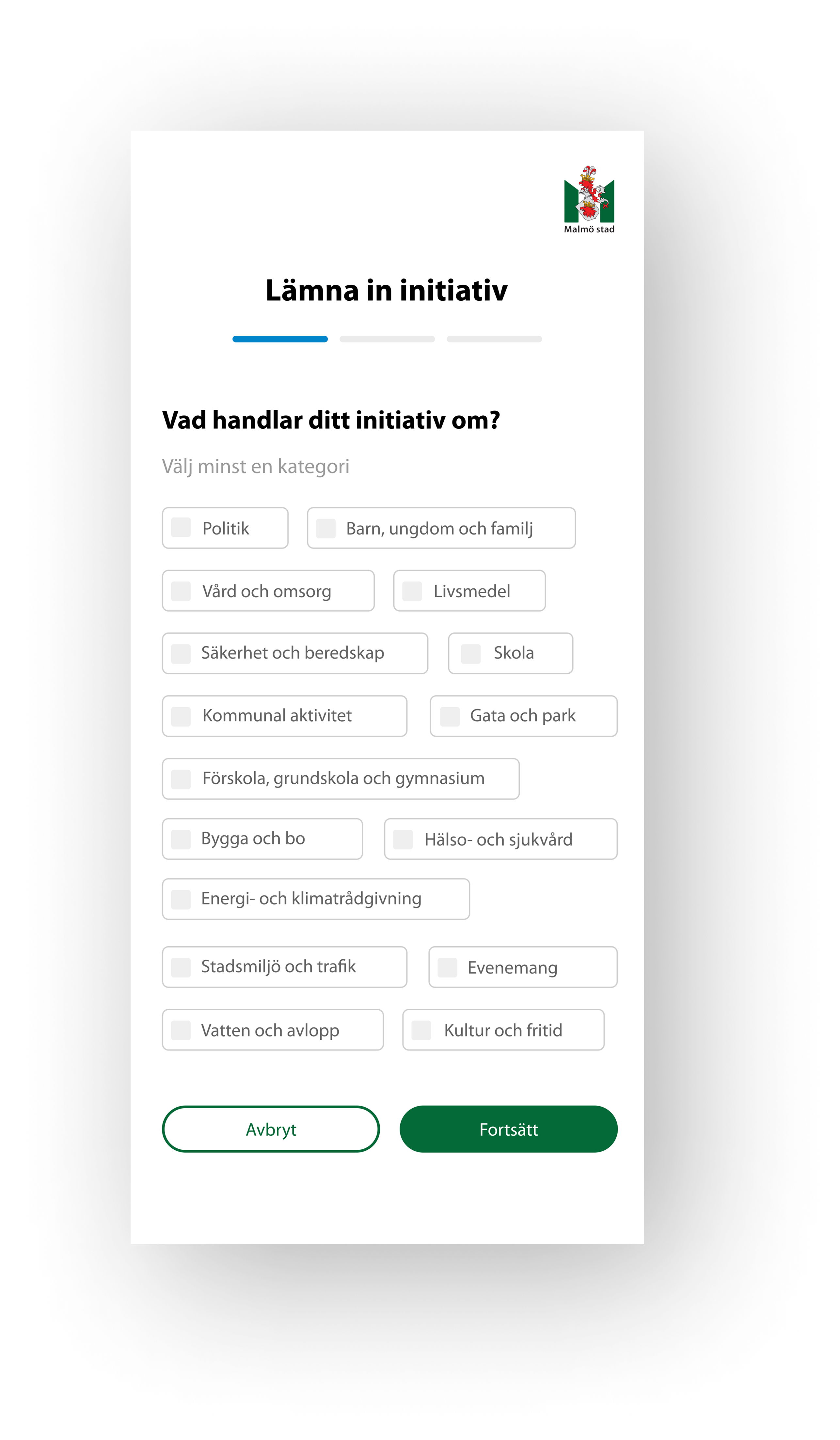
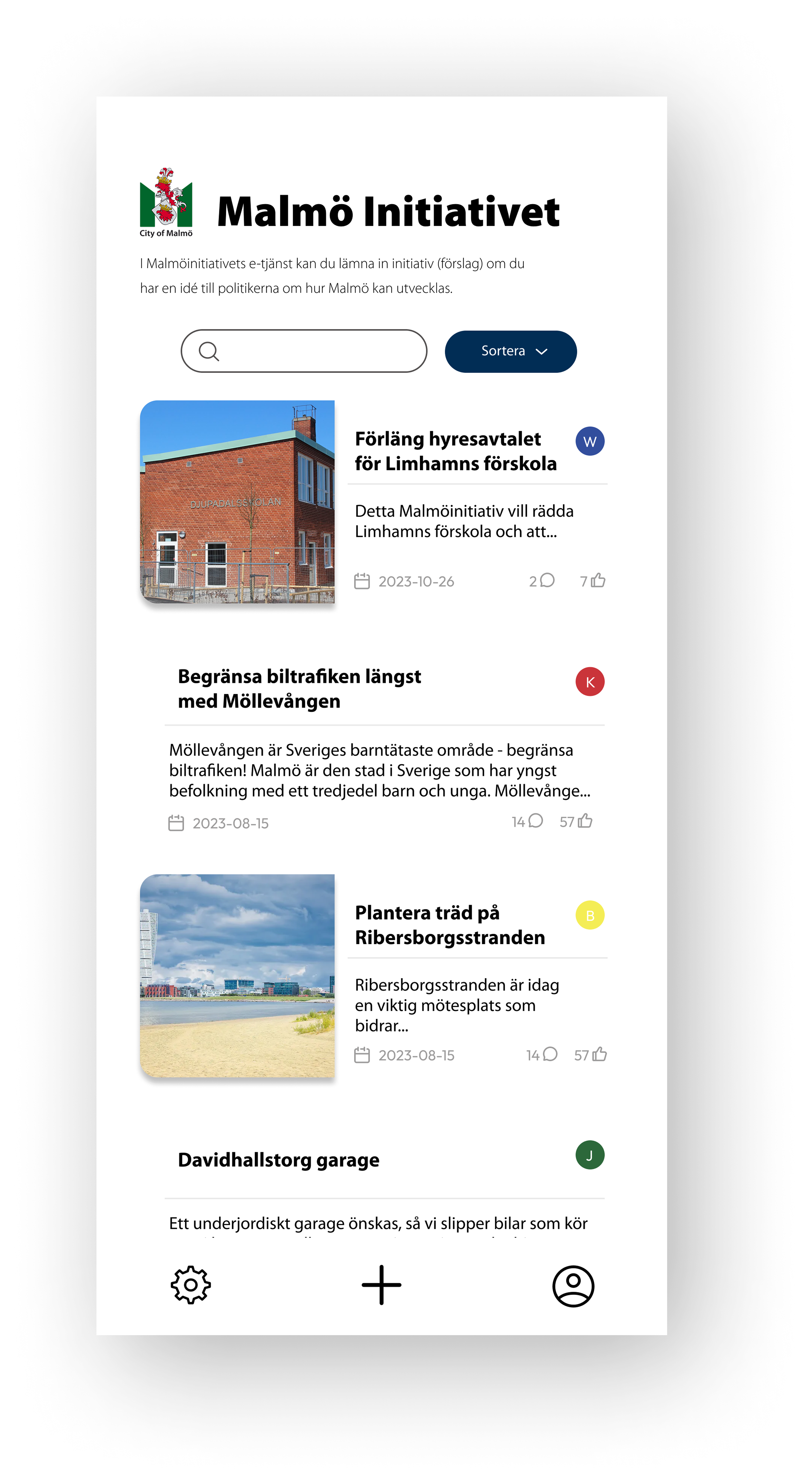
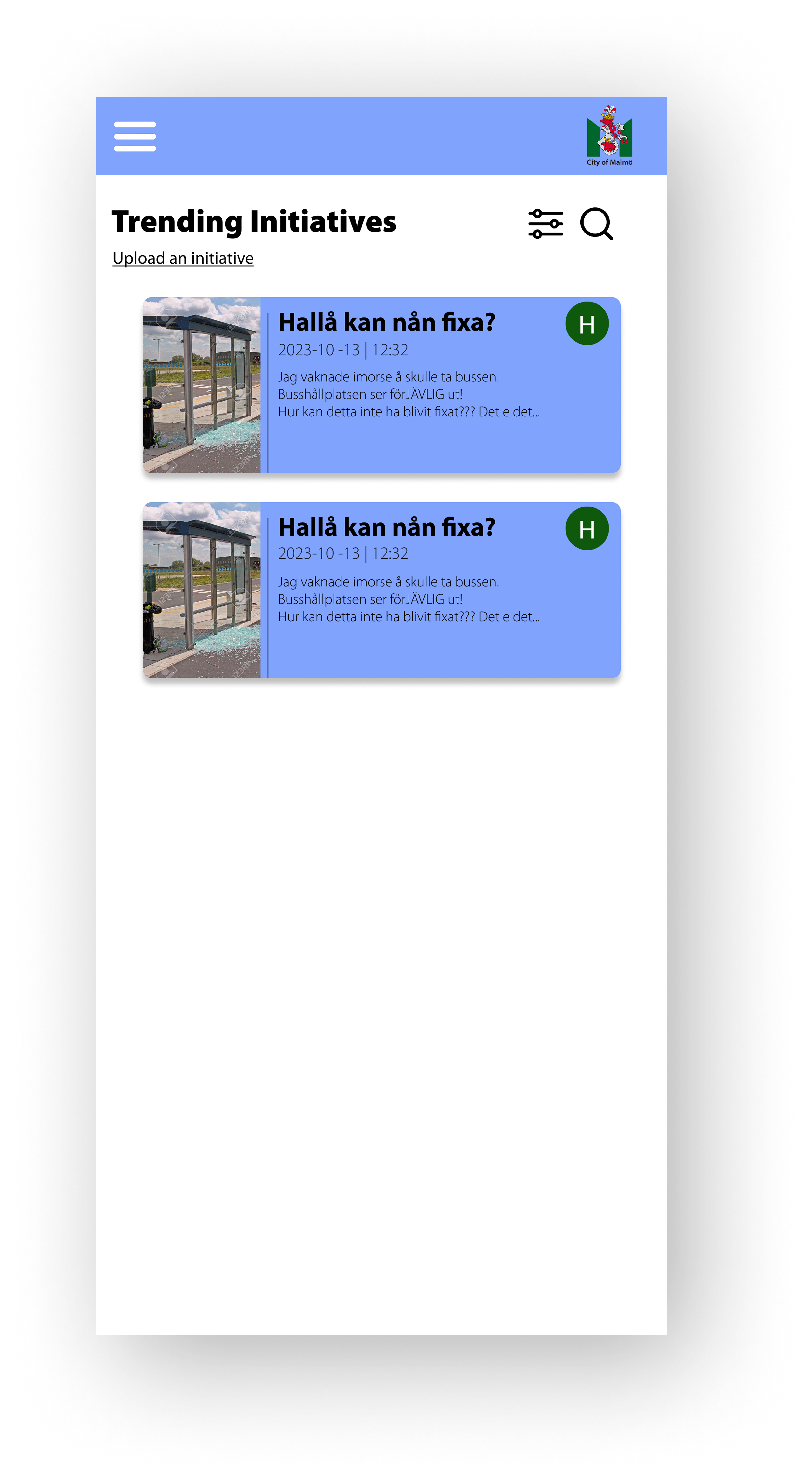
06. Prototype
Final Result
The prototype features a redesigned homepage for browsing initiatives, along with a more structured, step-by-step layout for submitting new ones—reducing the feeling of being overwhelmed.
Each post now displays it’s current status, and users can choose to follow specific initiatives. A search function and categorized filtering have also been implemented for easier navigation.