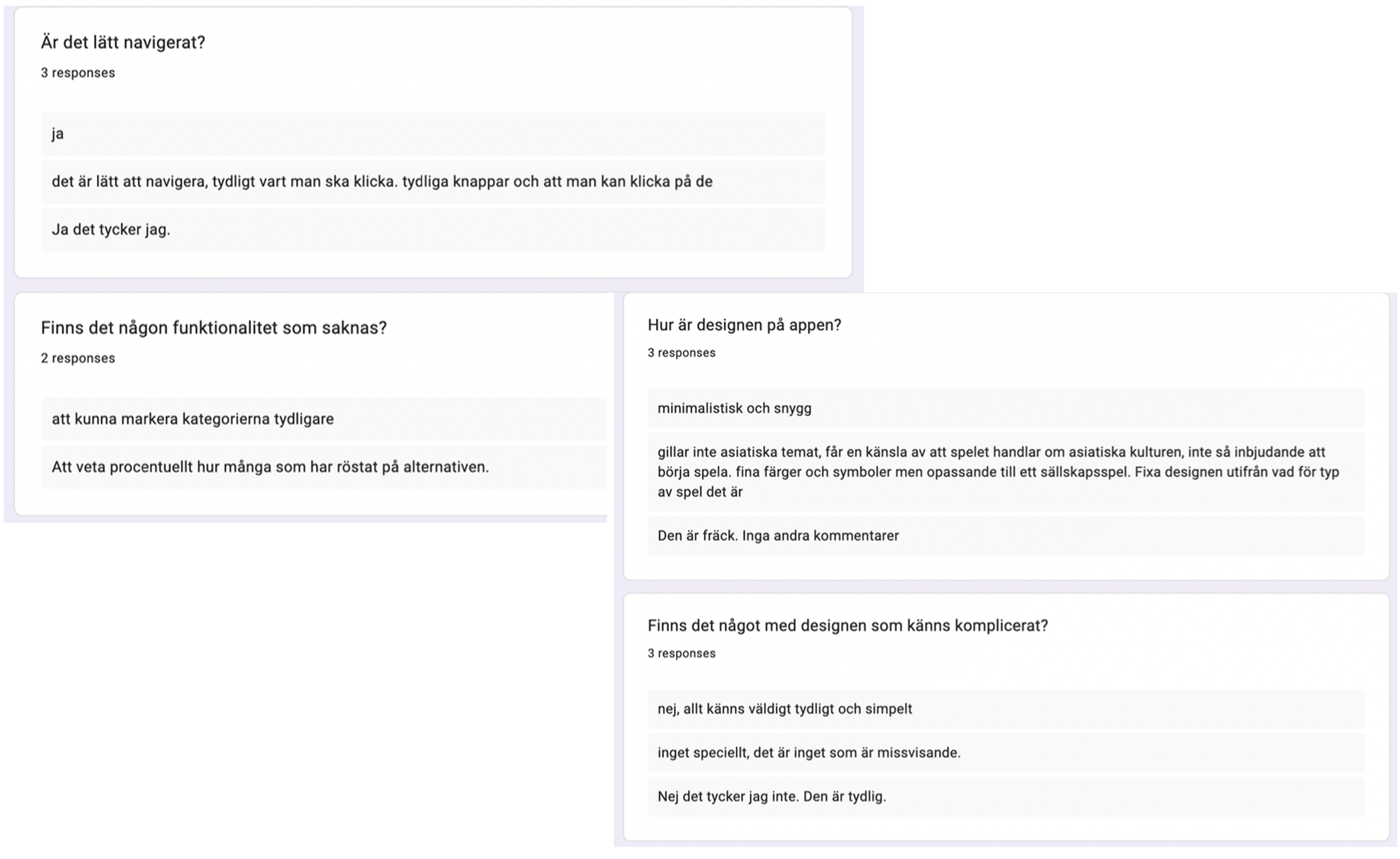
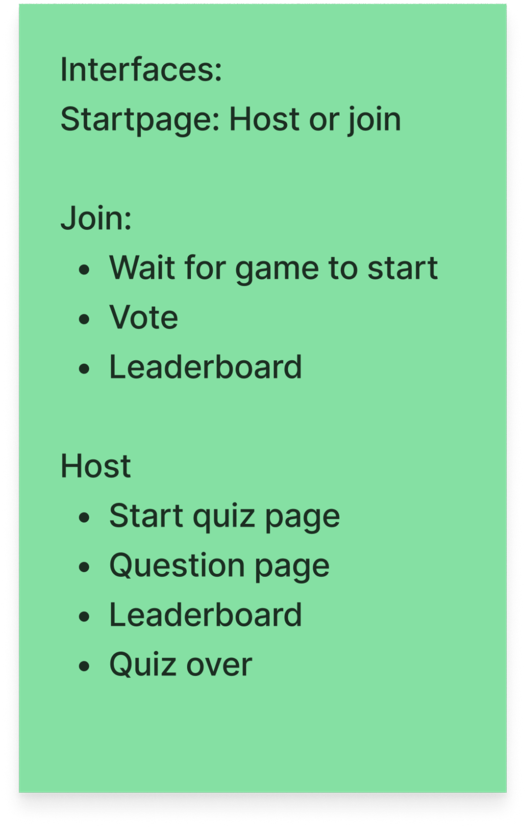
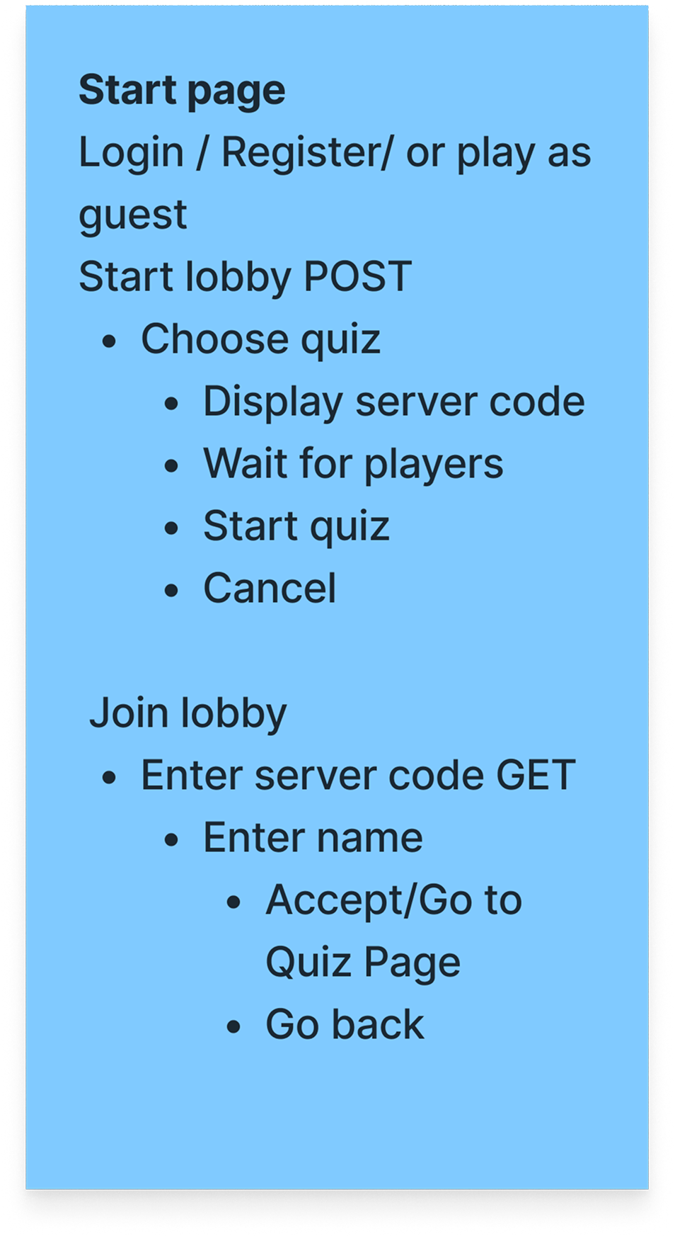
Who Knows Best?

2023/2024

My role

Designer

Platform

Mobile

Tools

Problem / Task

This project was about bringing people together in a fun, playful way. We designed and developed a web-based multiplayer game where players face off in random challenges, while others bet on who will win. The goal was to create an intuitive experience that balances usability, competition, and fun—while staying smooth and engaging for both hosts and players.

01. Research

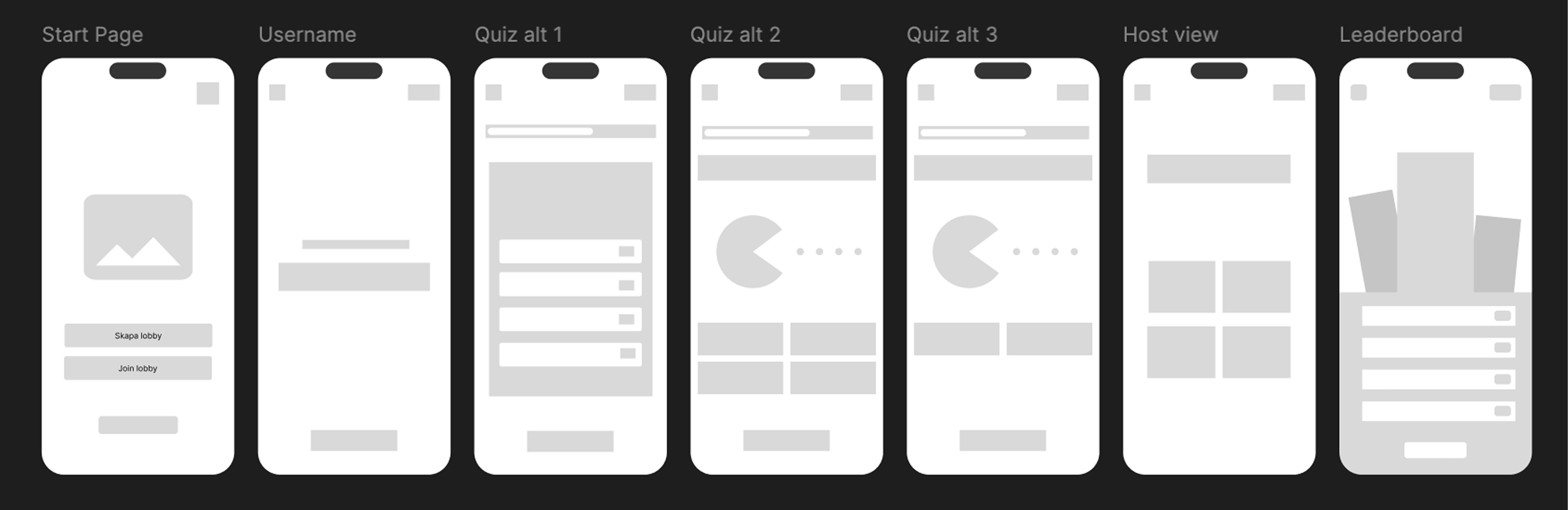
To kick off the project, we drew inspiration from existing multiplayer experiences like Kahoot, especially it’s game flow, lobby system, and the clear separation between host and player views. We wanted to capture that same sense of shared excitement, but in a more challenge-based, social context.

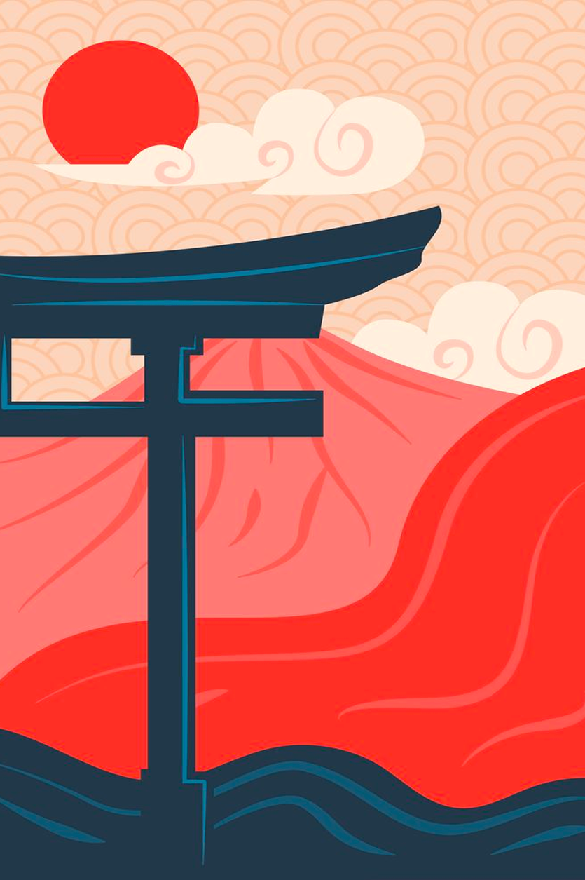
We began by brainstorming both functionality and visual direction. Inspired by East Asian design, we aimed to blend a calm, inviting aesthetic with a playful style—think calm design meets Japanese game shows. Clear typography, generous spacing, and a clean layout.

To guide our design choices, we collected inspiration from game apps, brochures, and UI references on Pinterest and Figma. This helped us stay aligned and develop a visual identity that felt both intuitive and fun for a social gaming experience.

02. Ideate

We began wireframing the in-game structure and eventually a first draft of the design.

Here are some scribbles of our thought process when ideating the interface structure:

03. UI

To support the playful yet calm visual identity we were aiming for, both colors and fonts were chosen with care. We went for a palette that felt fun and engaging without being overwhelming, helping guide users naturally through the interface.

#B8B1AA

#F1E6DB

#1E1F20

#EE7668

#FAF7FE

#F7BBB6

#463F5B

#D9D9D9

#F2AE99

The game features a playful and bold visual identity, highlighted by a large, fluffy-lettered logo that immediately sets the tone. Alongside the logo, we’ve used a range of simple, intuitive icons to support navigation and reinforce clarity—making it easier for users to follow along, place bets, and track progress without confusion.

The typography was kept clean to maintain clarity across different screens to ensure a smooth experience for all players.

Helvetica Neue Medium

Helvetica Neue Regular

Helvetica Neue Light

Roboto Condensed Regular

04. Validation

We conducted a survey where students tested our prototype and answered a series of questions afterwards. The survey was in Swedish, but the key takeaways were:

  • The interface was easy to navigate.
  • Categories needed clearer visual separation.
  • Users wanted to see what percentage of players voted for each participant.
  • The visual style felt too strongly tied to Asian culture, which was confusing since the game itself isn’t culturally themed.

05. Lessons learned

While the project successfully brought people together through a playful and social experience, there are aspects I would improve in hindsight. Some views—especially the game sequence where players are presented and challenges begin—could have been more polished and better aligned visually. Certain parts of the interface felt underdeveloped, and I would have liked to push the visual design further to create a more cohesive and immersive experience.

That said, the project was a valuable learning opportunity in designing a complete multiplayer game. It gave me deeper insight into user testing, interaction design, and how to prioritize features effectively when working with a limited timeframe.

06. Prototype

Final Result

The game features a minimal yet playful interface designed to support group interaction and real-time competition. The visual design combines soft, neutral tones with vibrant accent colors to create an engaging but non-distracting experience.

To support intuitive use, each screen includes clear call-to-action buttons, scoreboard icons, and responsive layout elements for both host and players. The structure is designed to be easy to follow, making the game accessible, fun, and easy to return to.

More to Explore