LasseMaja Detective Game
2024
My role
Designer & Developer
Platform
Mobile
Tools


Problem / Task
LasseMaja Detective Game is a crossmedia experience for children aged 7–11, based on the popular book series ”LasseMajas Detektivbyrå”. The project involved creating an engaging web-based game that combined digital gameplay with physical interaction. The main challenge was capturing the mystery-solving spirit of the books in a playful UI-format that encouraged critical thinking and exploration, all while staying true to the series visual style and tone.
01. Research
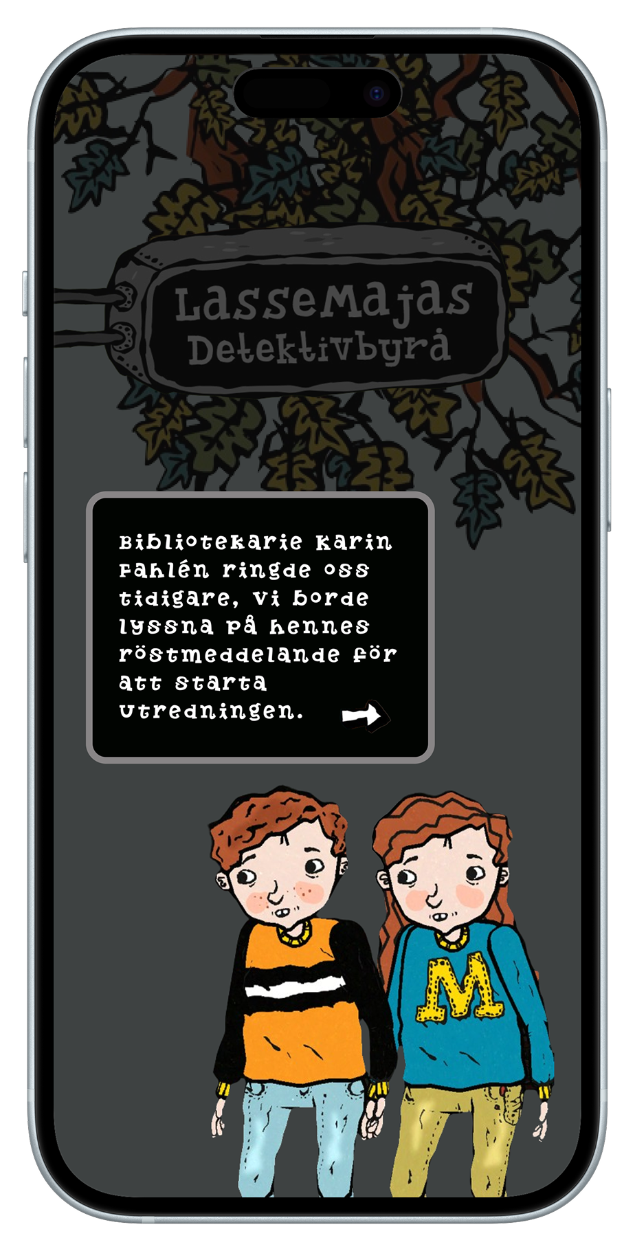
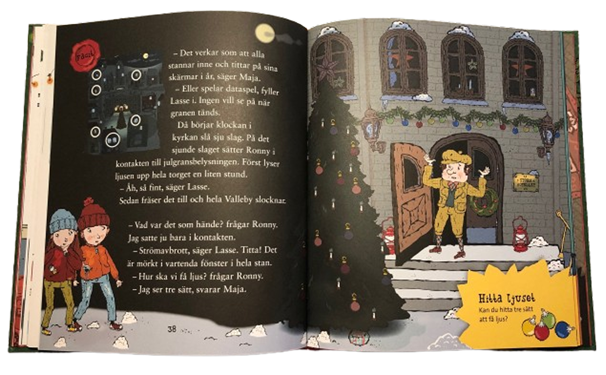
At the beginning of the project, all we had to work with was the source material: the LasseMajas Detektivbyrå books—their illustrations, tone, and visual expression. Naturally, this became our starting point. The world built within the books guided both the visual language and the structural concept of our experience.
Since this was a crossmedia project, we divided responsibilities early on. I collaborated with two classmates on the development of the web application, but I took sole responsibility for the design work. This included both the interface and visual assets connected to the physical experience.
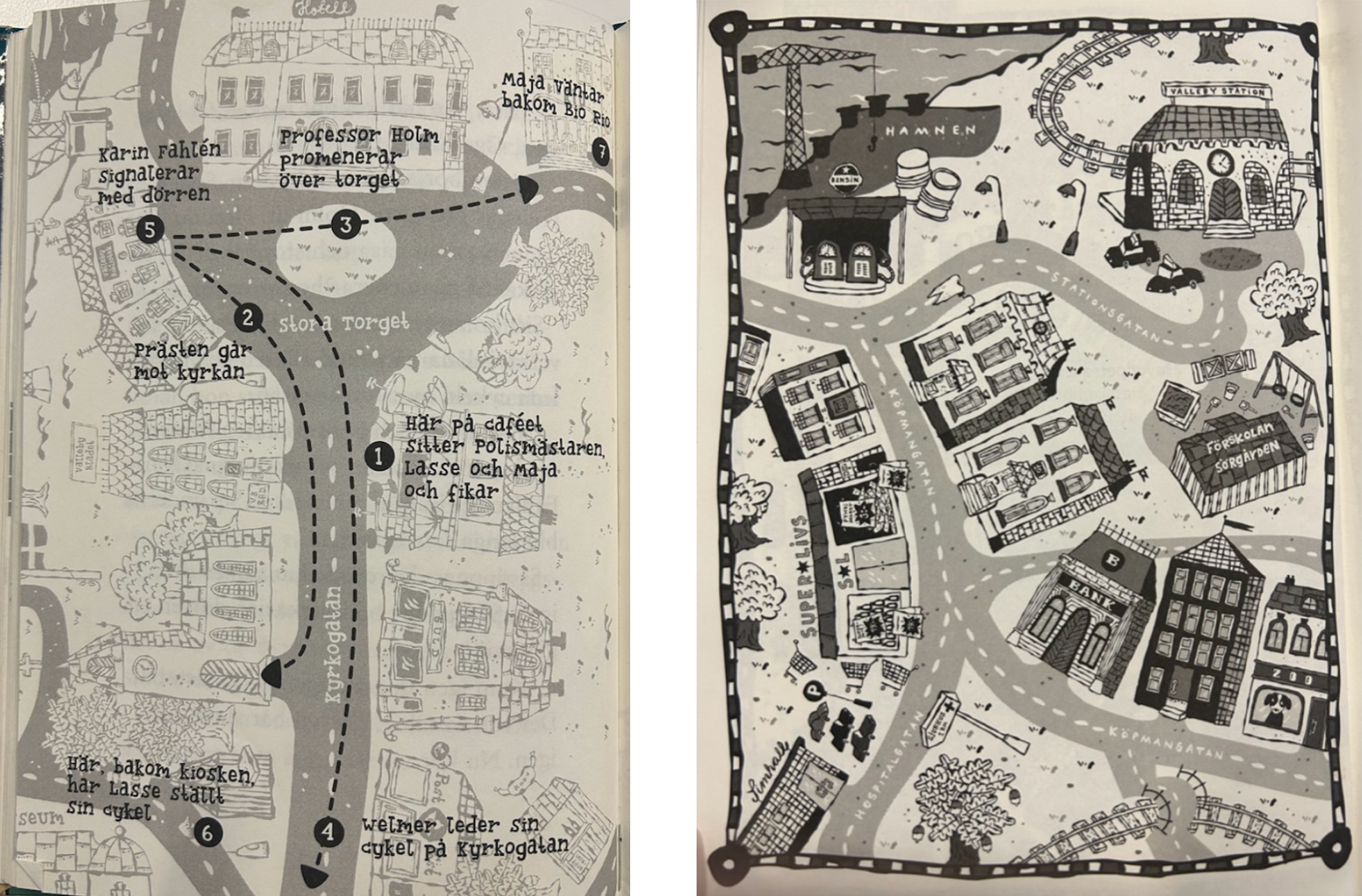
All visual inspiration was drawn directly from Helena Willis’ illustrations in the books and from the official website lassemajasdetektivbyra.se
. By mirroring this style, we stayed true to the brand.
The structure of the gameplay comes from looking into other mystery-solving interactive games, and then adapting them to a more kid-friendly format.
User Personas
We created three user personas to help understand the users needs, expectations and challenges related to the game.
Insights gained from this process included:
- Short and concise instructions
- Sound and visual feedback for user actions
- A clear interface that remains engaging and not overly simplistic
- Easily accessible clues (e.g., a question mark icon)
- A sense of reward for motivational purposes


02. Ideate
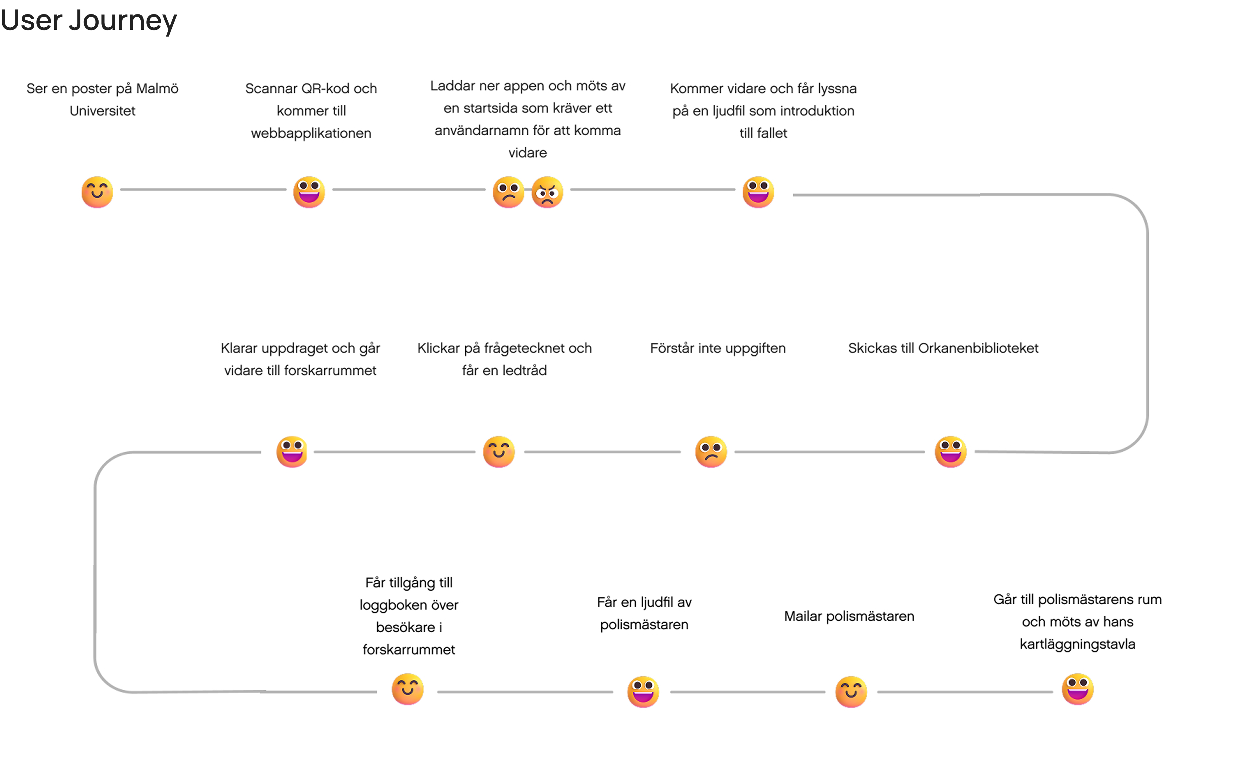
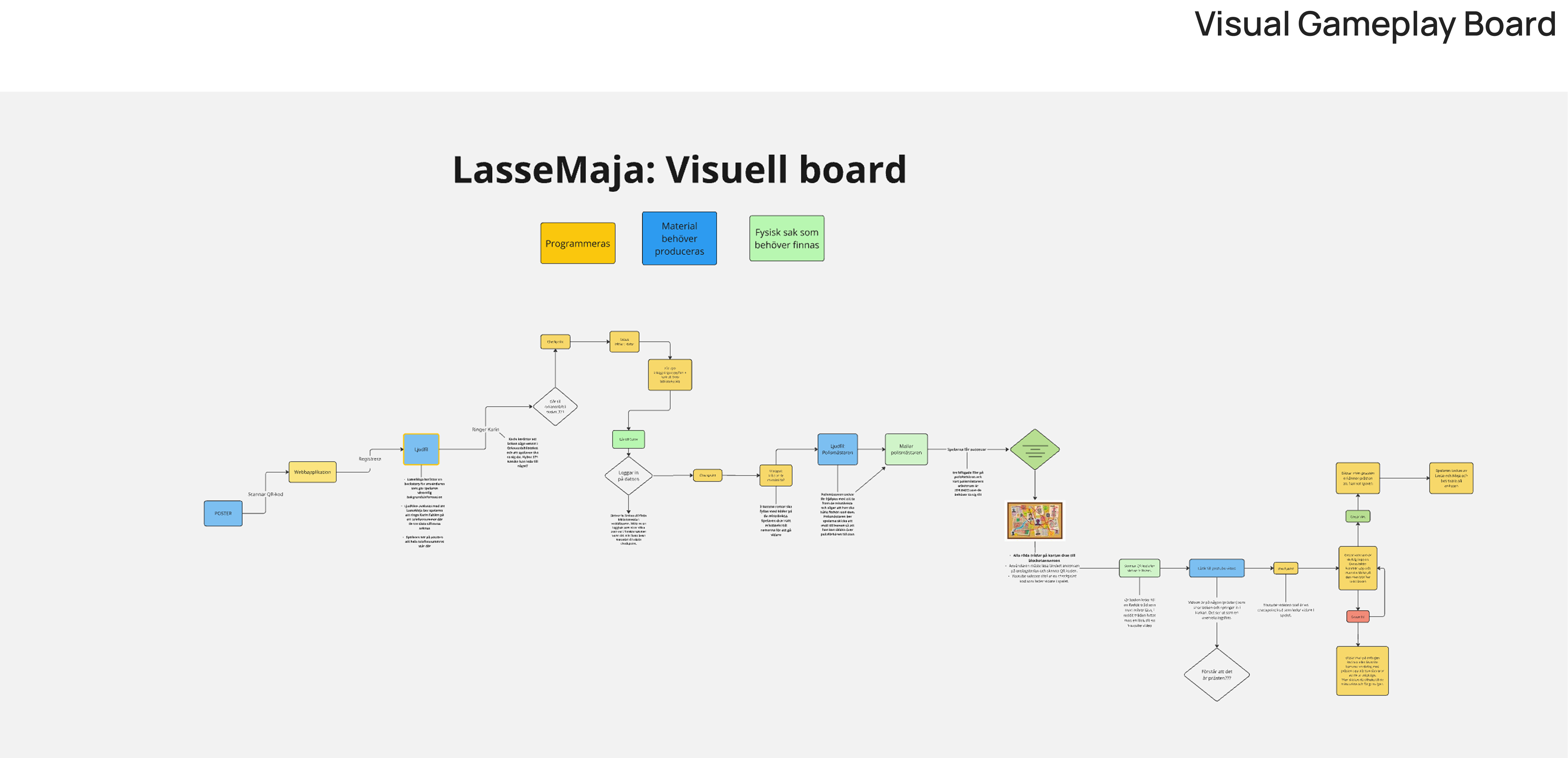
By ideating and establishing a step-by-step structure for the game, we began visualizing the user journey and overall gameplay experience. This process helped identify key interactions, transitions, and potential pain points.
03. UI
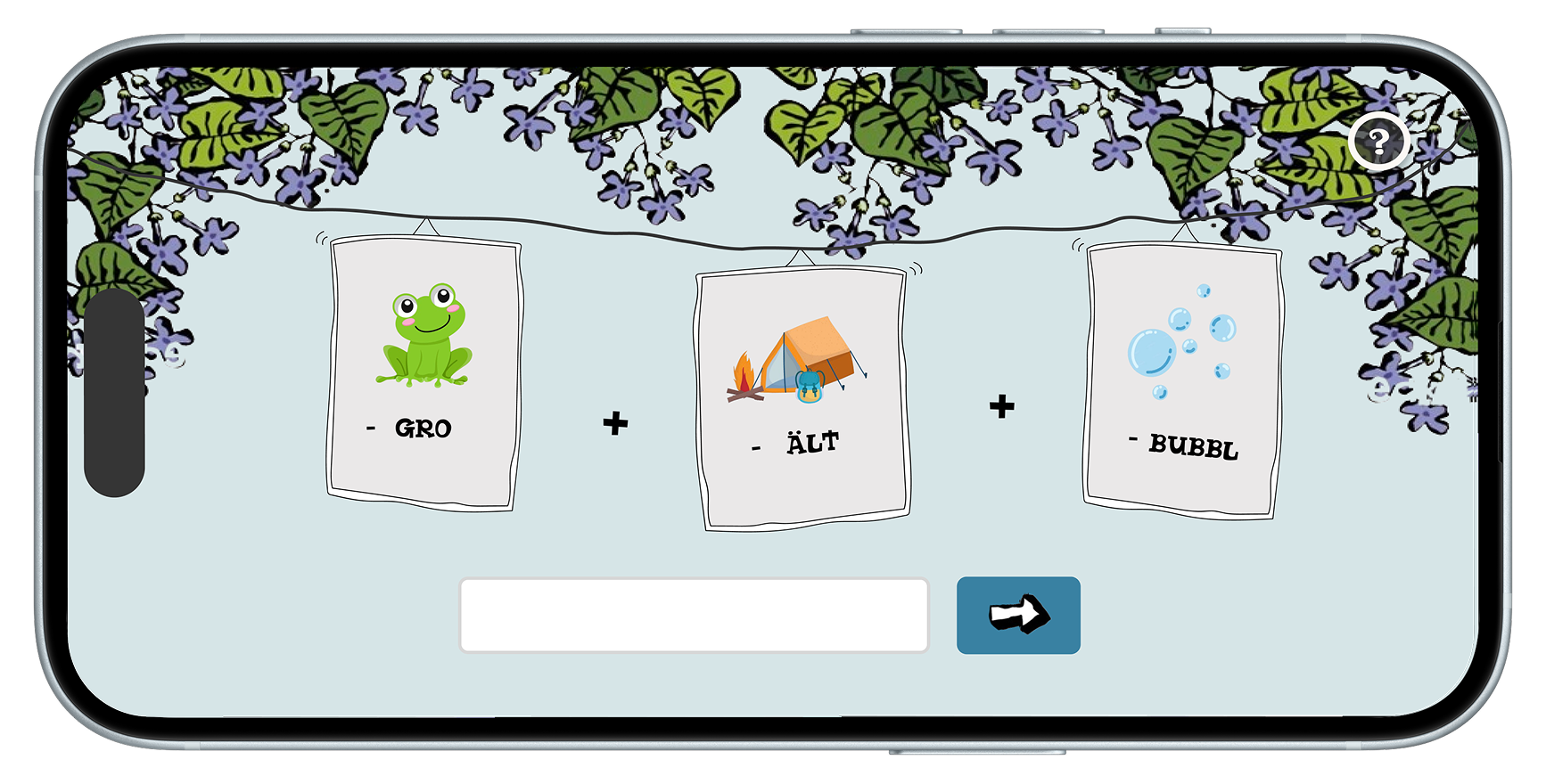
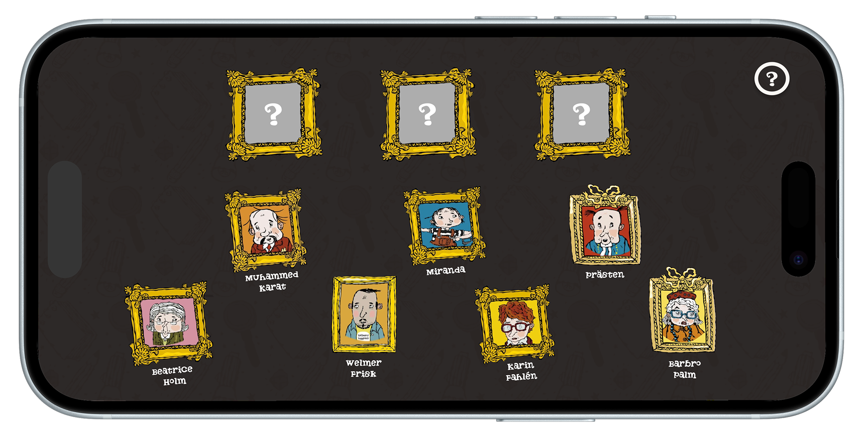
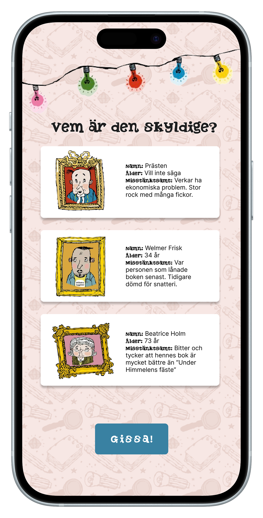
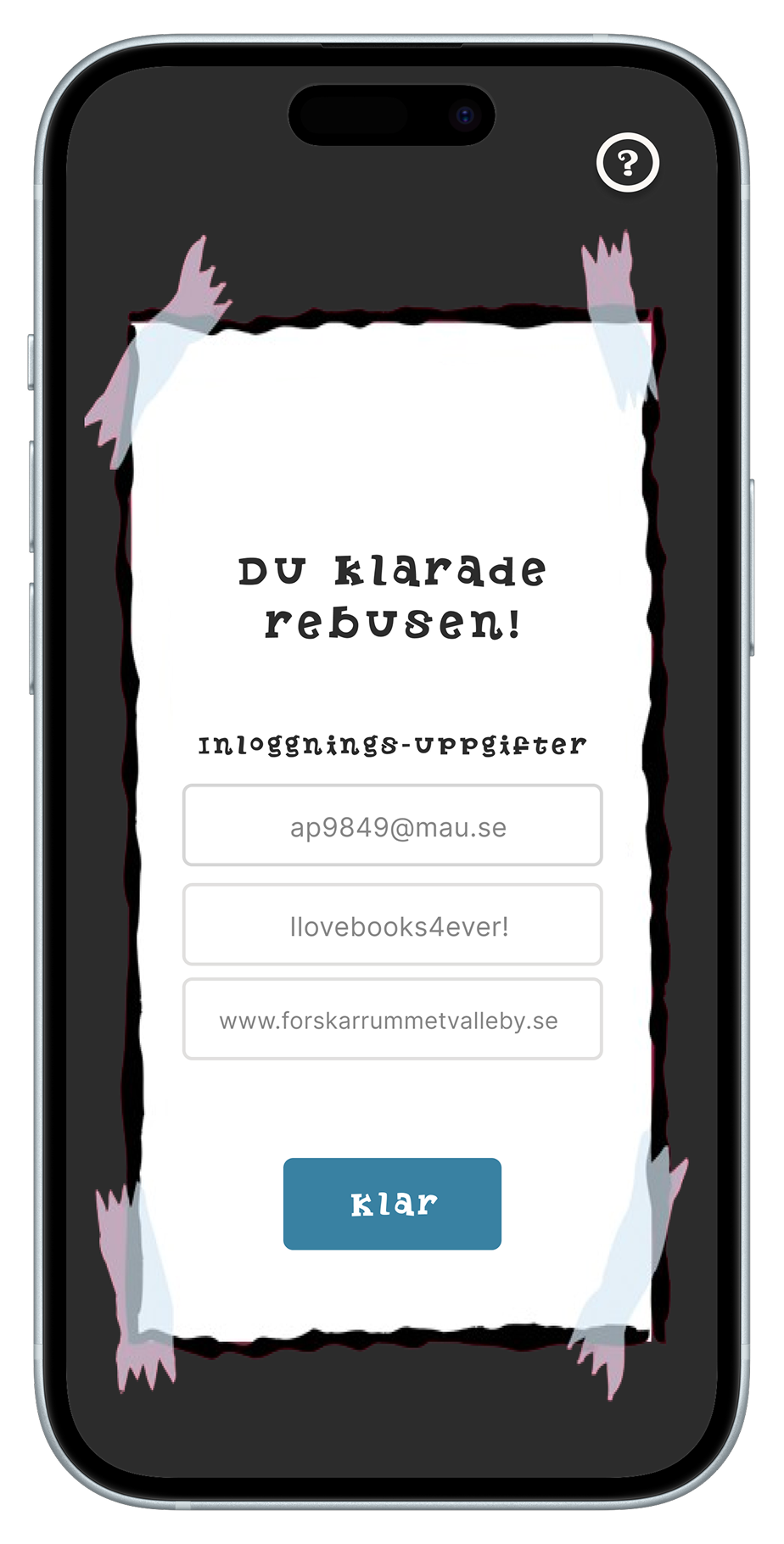
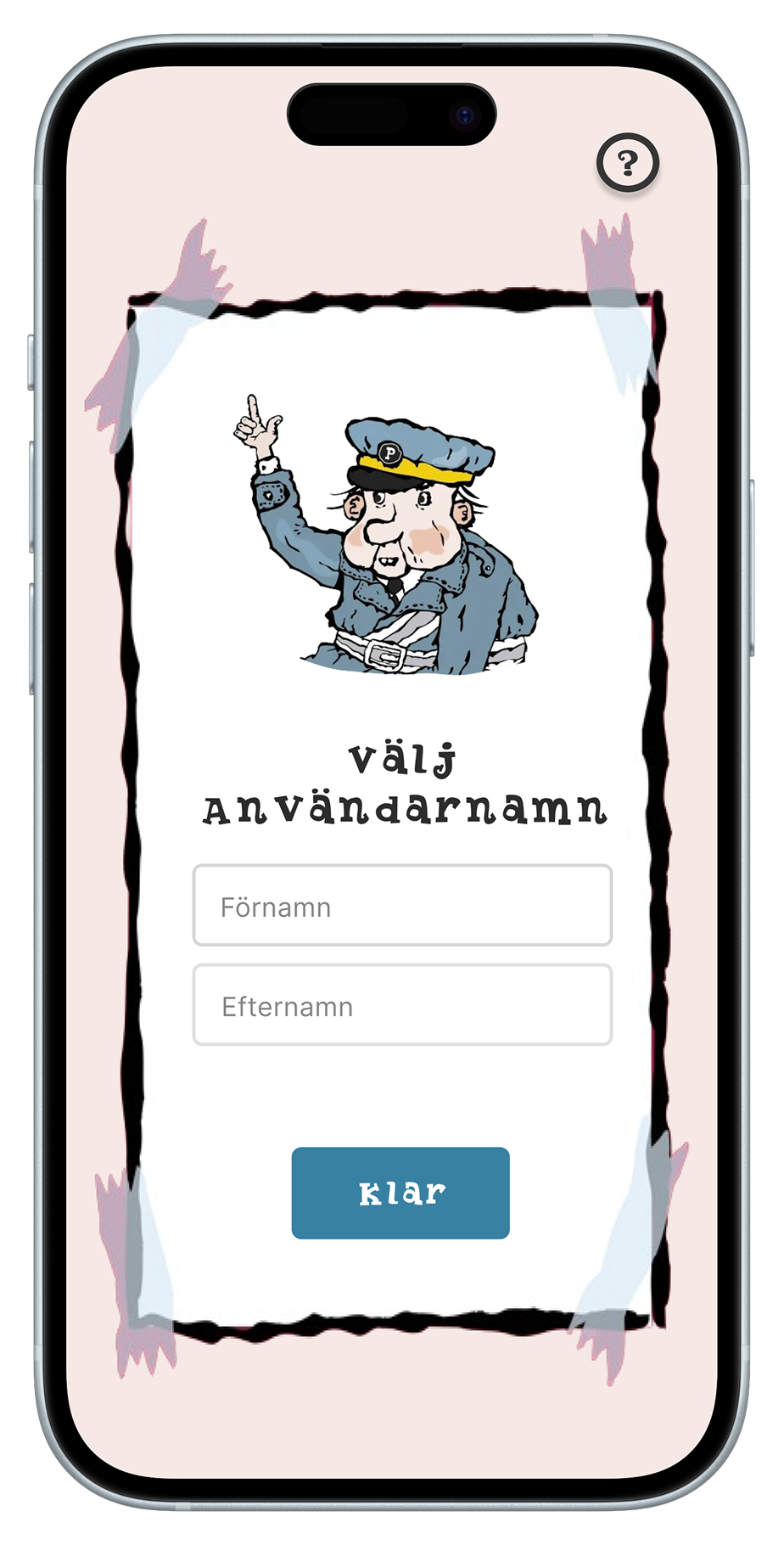
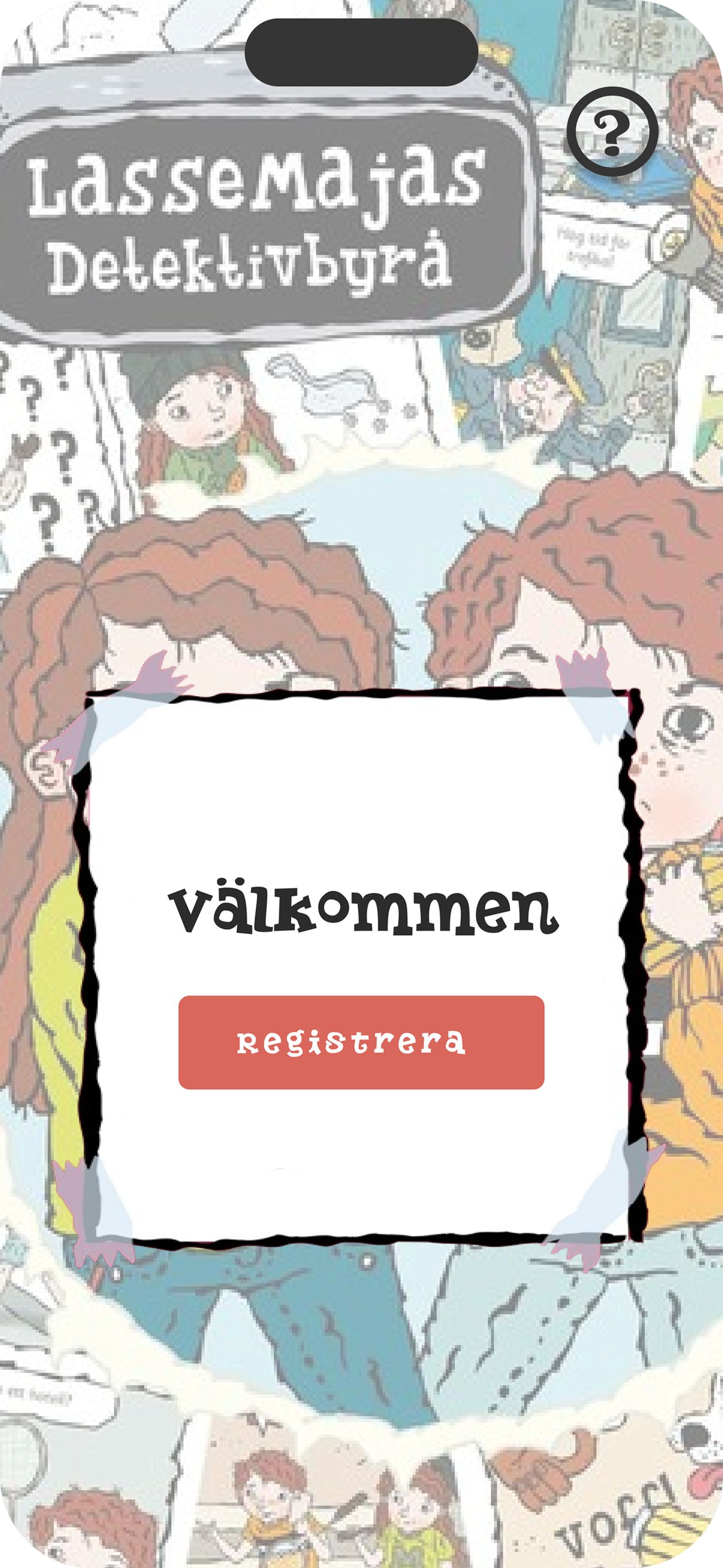
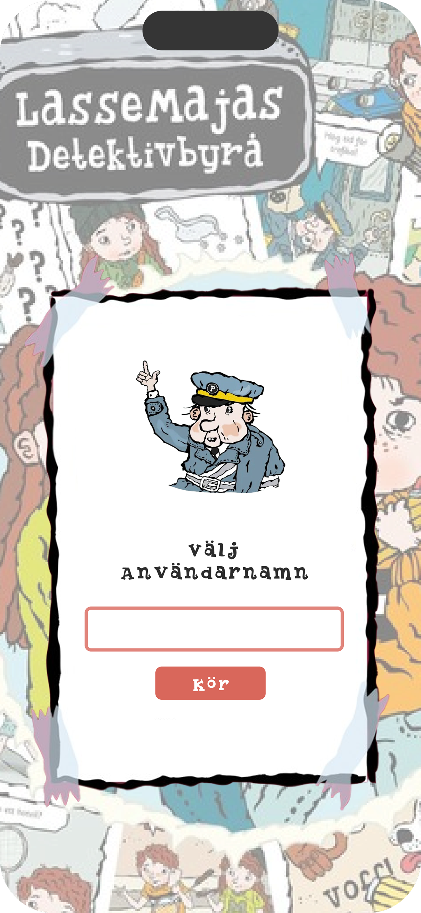
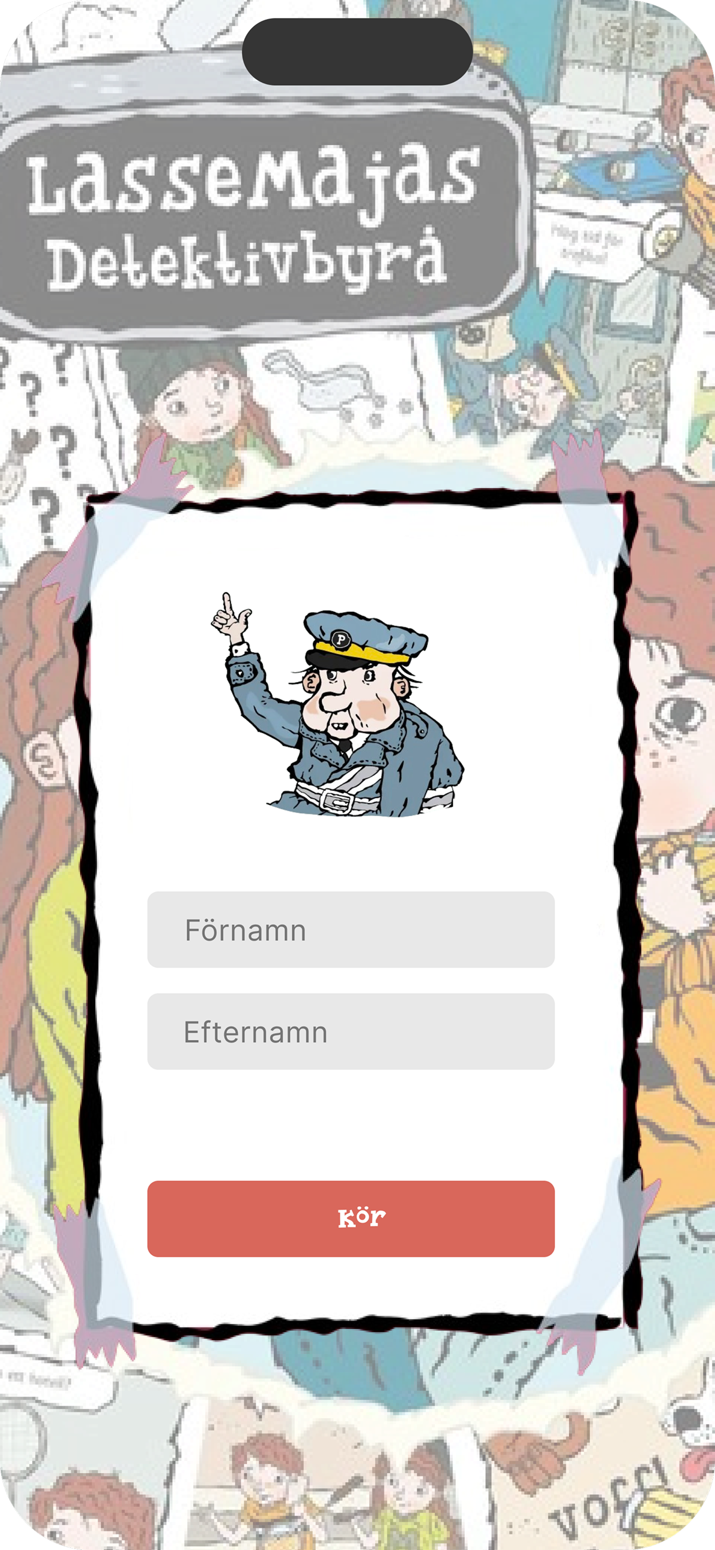
We chose playful yet easy-to-read fonts to appeal to children and ensured the text is easy to read. The color palette features bright and inviting colors that convey a warm and friendly atmosphere. Due to copyright restrictions, we couldn’t use the exact same font as in the books but found a very similar alternative.
#3981A2
#D6E5E7
#985571
#D9675B
#F6E8E4
#FFFFFF
#2C2C2C
For headings and larger text, we used Butterfinger Serif, while Inter was used for body text to ensure optimal readability.
Butterfinger Serif Regular
Inter Regular

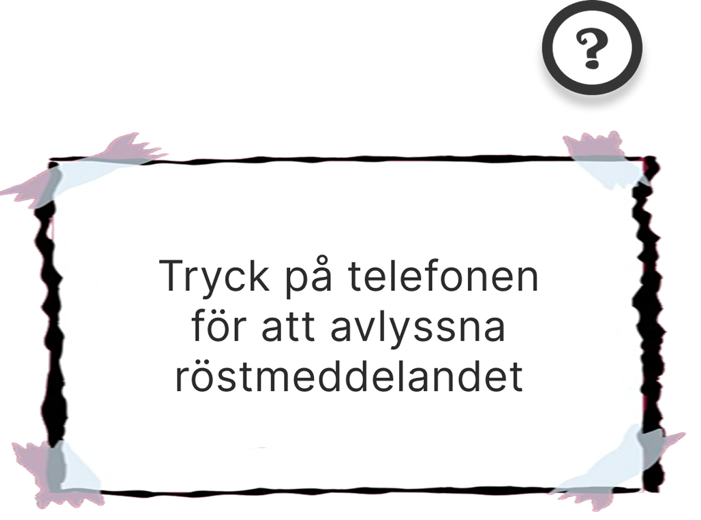
Intuitive buttons guide users through the app. Since the game takes place in both digital and physical environments, we anticipated occasional confusion about the next steps. To promote critical thinking while still providing support, each interface features a question mark icon for hints and arrows that allow users to return to previous steps if needed.


04. Validation
Here are some examples of the prototype in the initial design stages:
We received feedback from fellow students that the interface felt cluttered. Since we included many visual elements to reflect the style of the LasseMaja books, we had to simplify and adjust the layout to avoid overwhelming the user and improve clarity.
05. Lessons learned
Looking back at this project, we really enjoyed blurring the lines between digital and physical experiences. Working in a cross-functional team allowed me to grow in both storytelling and UX thinking. Designing a game that felt intuitive, immersive, and engaging for children required thoughtful balancing of visual identity, usability, and playfulness.
A key takeaway was the importance of planning and time management. With a clearer timeline, we could have avoided some last-minute stress. This experience highlighted the value of structuring your work early on, which is something I carried with me into later projects.

06. Prototype
Final Result
The game features a minimal yet playful interface designed to support group interaction and real-time competition. The visual design combines soft, neutral tones with vibrant accent colors to create an engaging but non-distracting experience.
To support intuitive use, each screen includes clear call-to-action buttons, scoreboard icons, and responsive layout elements for both host and players. The structure is designed to be easy to follow, making the game accessible, fun, and easy to return to.